Bonus Page
Bonus Page
Gaming, Product Design
Gaming, Product Design
2025
2025
One of the most visited pages on the platform, yet consistently underperforming in user trust and engagement.
A visual and structural redesign focused on clarity, consistency, and alignment with the broader design system.
Bonus Page
Gaming, Product Design
2025
One of the most visited pages on the platform, yet consistently underperforming in user trust and engagement.
A visual and structural redesign focused on clarity, consistency, and alignment with the broader design system.


Overview
A page that needed to earn back user trust.
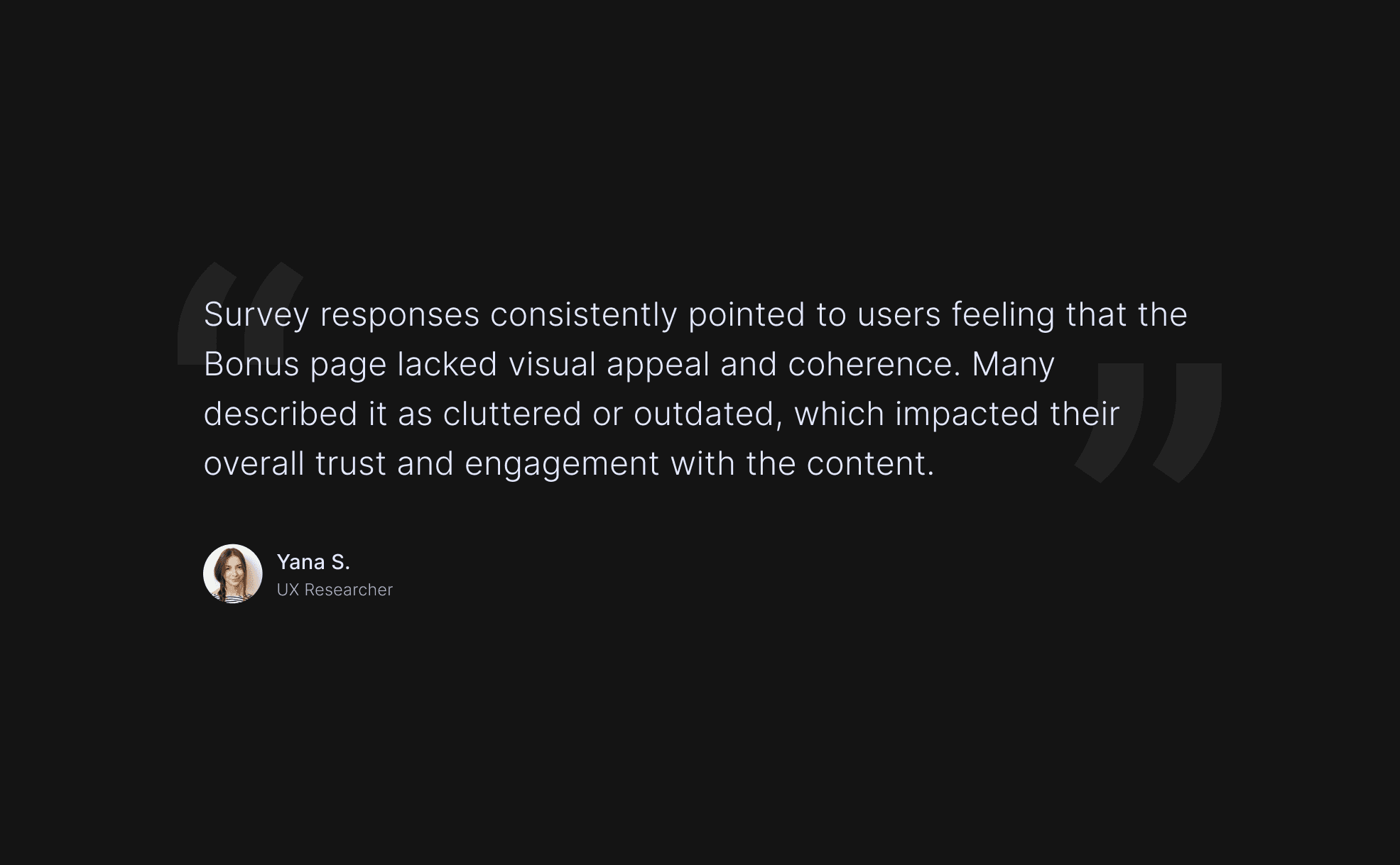
Users found the Bonus Page visually cluttered and outdated, which hurt trust and engagement. The brief was to redesign it within existing structure and stakeholder requirements.
The Challenge
Balancing business priorities with design quality.
Poor visual hierarchy, inconsistent components, and an outdated aesthetic. The design needed to satisfy both business priorities and design quality without a full structural rebuild.
My Process
From stakeholder brief to developer handoff.
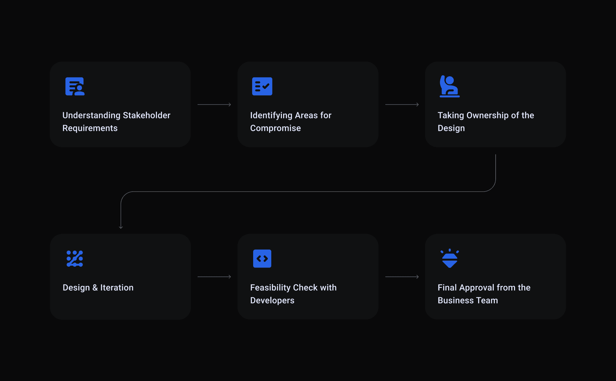
Stakeholder alignment first, then identifying areas for compromise, taking ownership of the design direction, iterating, and final sign-off with developers and the business team.
Design Improvements
The same page, done properly.
Cleaner hierarchy, updated graphics, consistent components, and a visual language aligned with the rest of the platform. Old design versus new, the difference is visible immediately.
Outcome
Cleaner, sharper, and better received.
Improved visual clarity, stronger user trust, better bonus engagement, and full stakeholder alignment from design through to delivery.
Overview
The Challenge

My Process
Design Improvements


Outcome
Overview
A page that needed to earn back user trust.
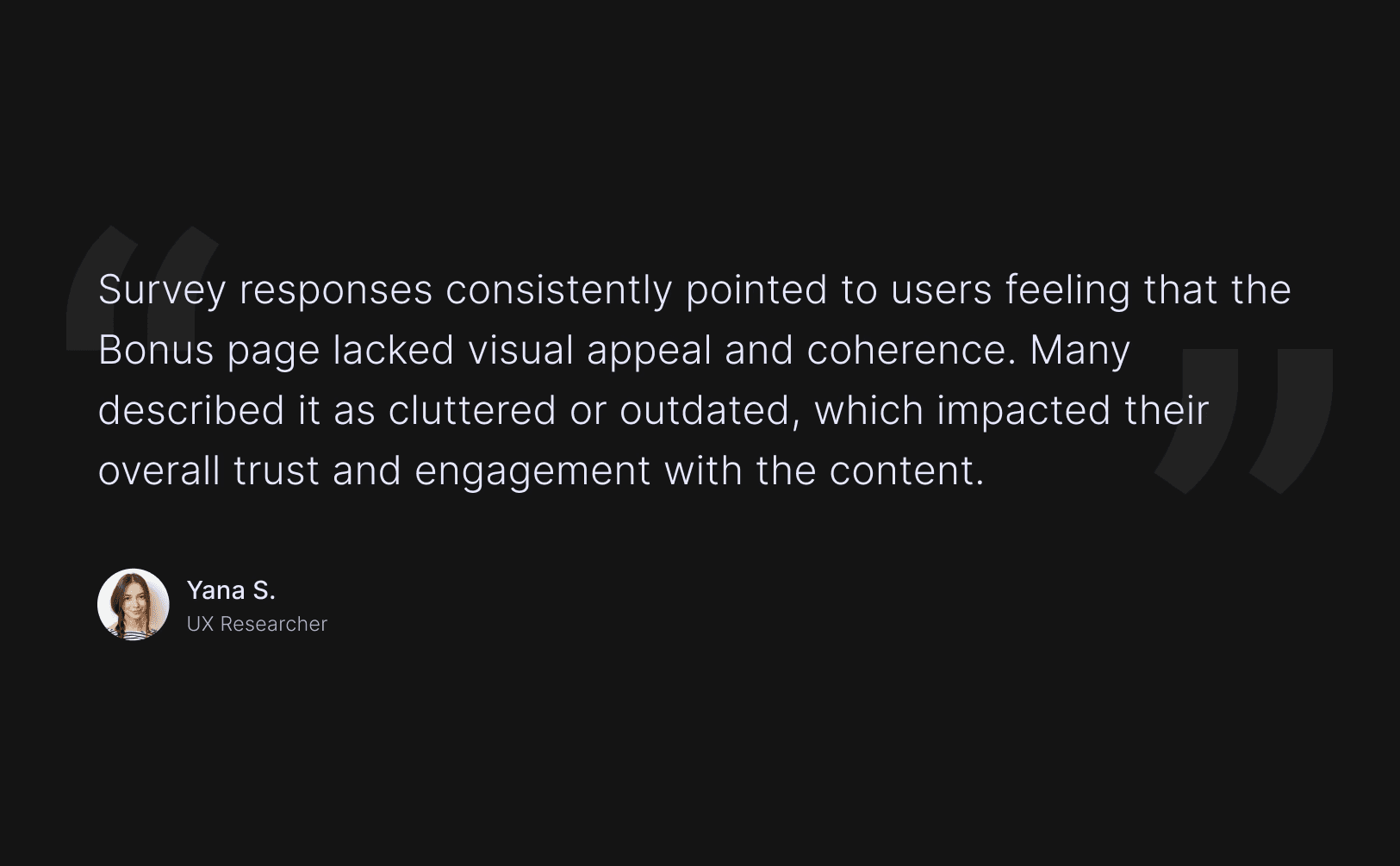
Users found the Bonus Page visually cluttered and outdated, which hurt trust and engagement. The brief was to redesign it within existing structure and stakeholder requirements.
The Challenge
Balancing business priorities with design quality.
Poor visual hierarchy, inconsistent components, and an outdated aesthetic. The design needed to satisfy both business priorities and design quality without a full structural rebuild.

My Process
From stakeholder brief to developer handoff.
Stakeholder alignment first, then identifying areas for compromise, taking ownership of the design direction, iterating, and final sign-off with developers and the business team.


Design Improvements
The same page, done properly.
Cleaner hierarchy, updated graphics, consistent components, and a visual language aligned with the rest of the platform. Old design versus new, the difference is visible immediately.

Outcomes
Cleaner, sharper, and better received.
Improved visual clarity, stronger user trust, better bonus engagement, and full stakeholder alignment from design through to delivery.
Outcome
Cleaner, sharper, and better received.
Improved visual clarity, stronger user trust, better bonus engagement, and full stakeholder alignment from design through to delivery.